Boosting conversions for an e-commerce brand
I redesigned FitFlop’s customer journey for +300k customers, refreshing the brand’s UI, addressing purchasing barriers and boosting conversions.

Client
FitFlop
Dates
Apr to Nov 2024
Role
Visual/UI design, interaction design, design system design, prototyping
Platforms
Web
Teams
Product, Engineering, Digital
Tools
Figma, Google Analytics
Summary
FitFlop wanted to refine their online shopping experience for their +300k customers and address challenges in their purchasing journey to improve overall conversions. In an effort to solve these problems while refreshing the footwear brand’s UI, I leveraged qualitative and quantitive data to redesign their core customer journey.
What I delivered
A user journey map highlighting key areas of the customer journey
A stakeholder workshop to collaboratively identify challenges and ideate potential solutions in the journey
Pixel-perfect and responsive new designs ready for development
FitFlop's first design system supporting UI consistency and accelerating future design work
Outcomes
Since launching the new designs, FitFlop has seen measurable improvements in conversion and revenue metrics:
+22% increase in overall conversions year-on-year
Increase in checkout completion rate (from 47% to 55%) following launch of redesigned checkout flow
+20% increase in Revenue Per Visitor from new promotional messaging on product pages
THE CHALLENGE
Create a better shopping experience and improve conversions
FitFlop wanted to enhance their digital shopping experience and increase conversion rates by identifying and addressing pain points throughout their customer journey.
My goal was to create a more seamless path from product discovery to checkout, minimising friction that could lead to cart abandonment and reducing barriers to checkout.
USER RESEARCH
"The homepage feels a lot more modern and has more energy around it."
To identify pain points in the customer journey, the research team at the agency I work for carried out 12 user research sessions with participants in the UK and US and analysed FitFlop’s Google Analytics data.
Several key insights influenced our design enhancements:
Conversion rates were substantially higher for customers that landed on or saw the homepage.
Users described the homepage as more modern and energetic, and seeing it helped sell them on the FitFlop brand and its products.
The "Comfort Technology" page convinced people of the benefit's of FitFlop's proprietary technology but users rarely go to it.
Customers weren't encouraged or guided towards the checkout and barriers like hidden buttons and unnecessary clicks made getting to the checkout feel long.
Original page designs
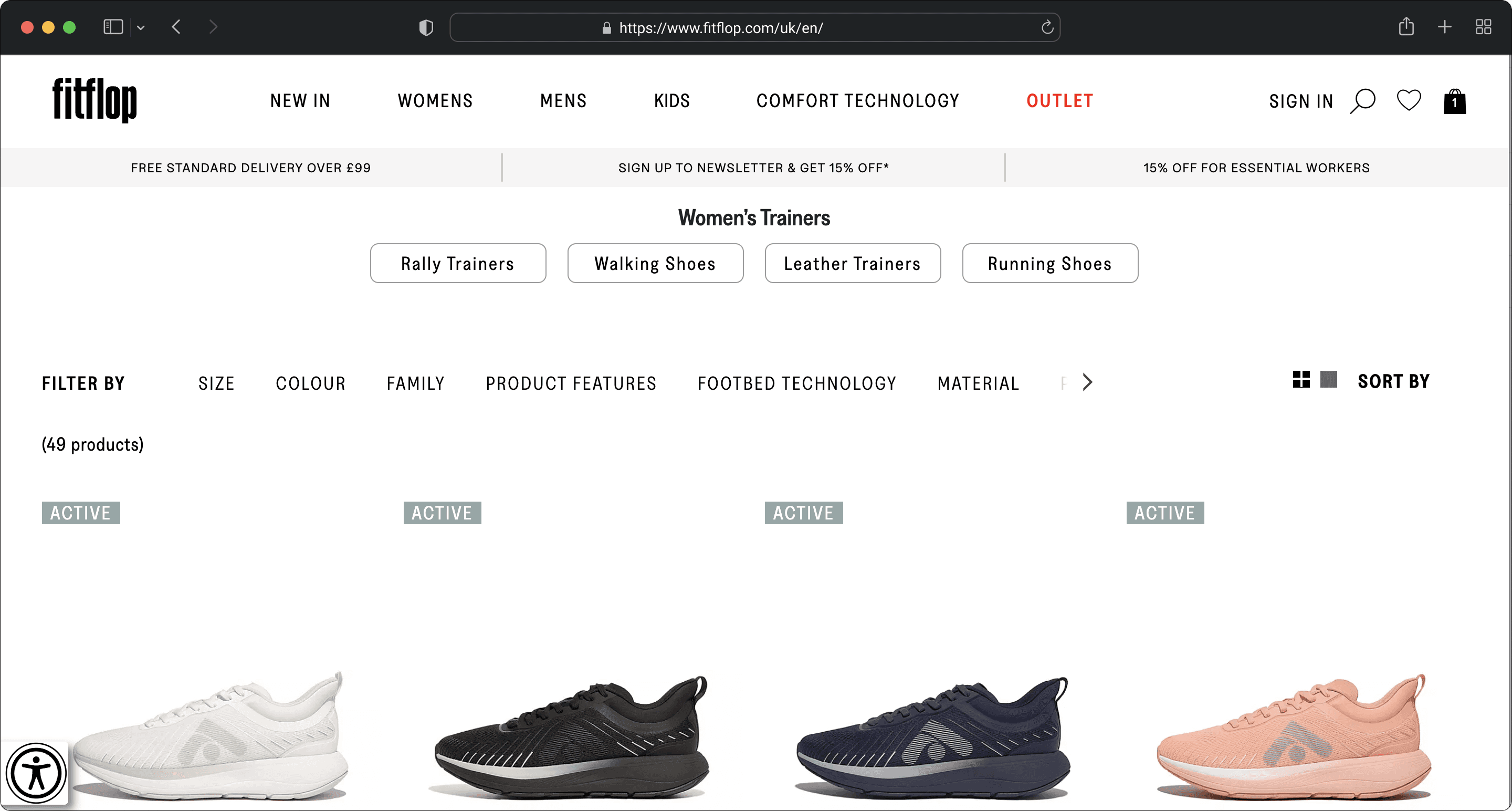
Product list page before I redesigned it
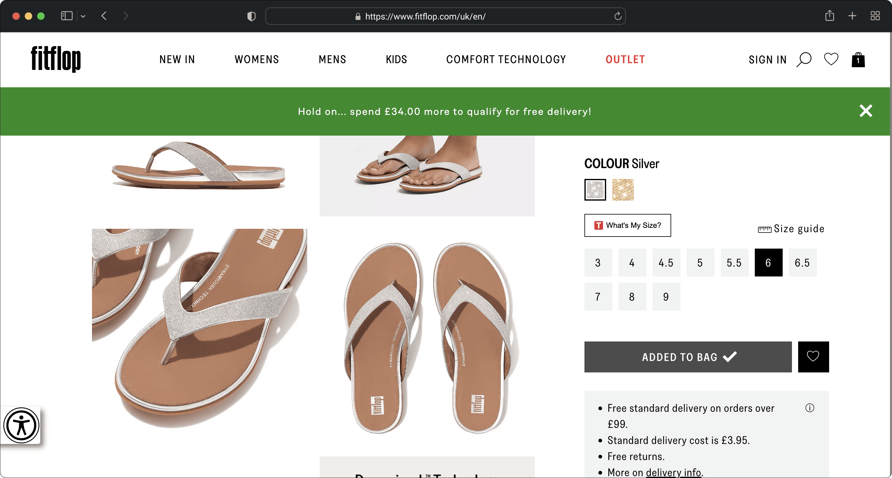
Product description page before I redesigned it
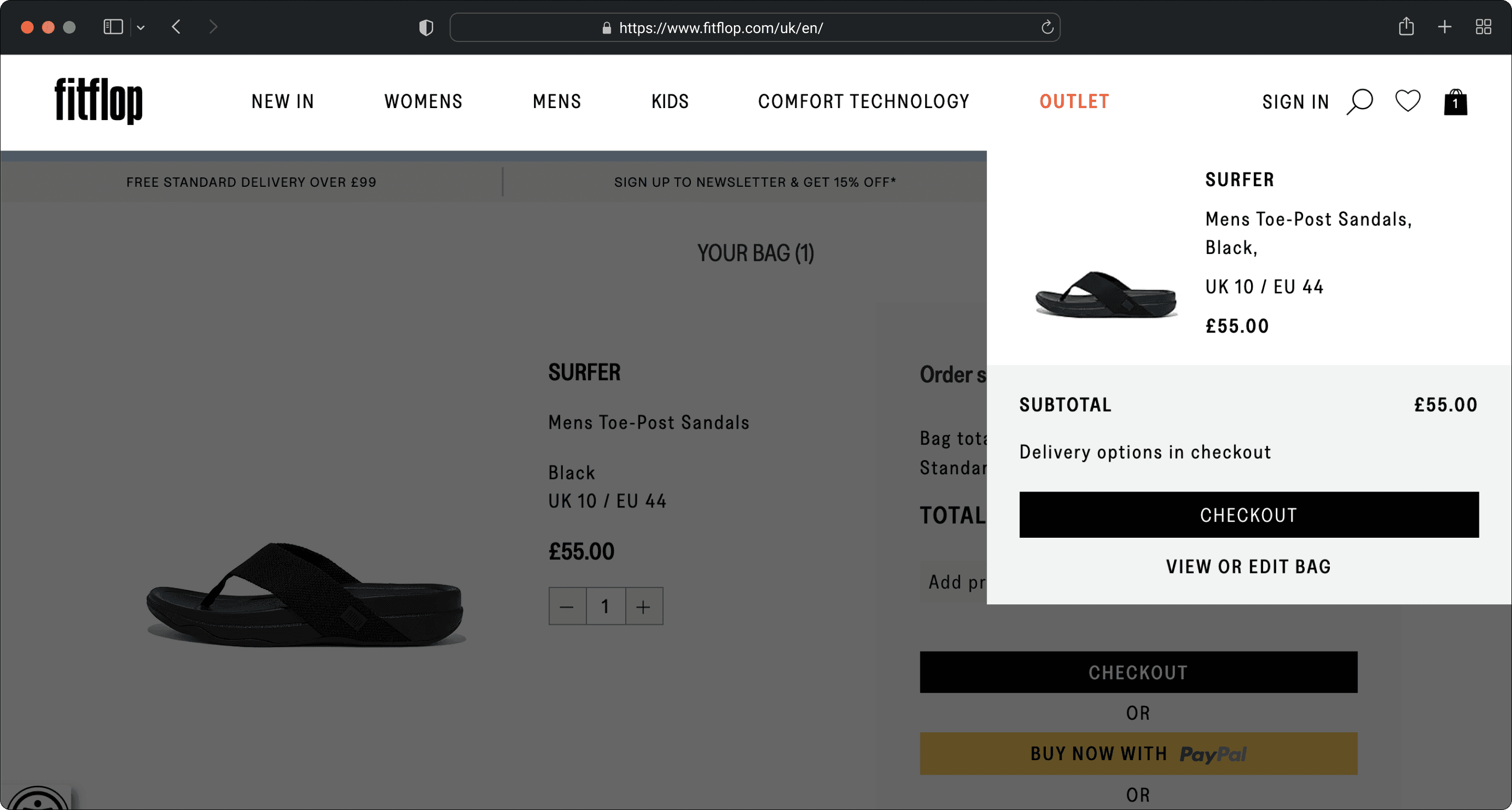
Bag flyout before I redesigned it
FINAL DESIGNS
Consistent brand storytelling and a clear route to checkout
My design updates aimed to address the issues found in research while also tidying up and modernising FitFlop's UI.
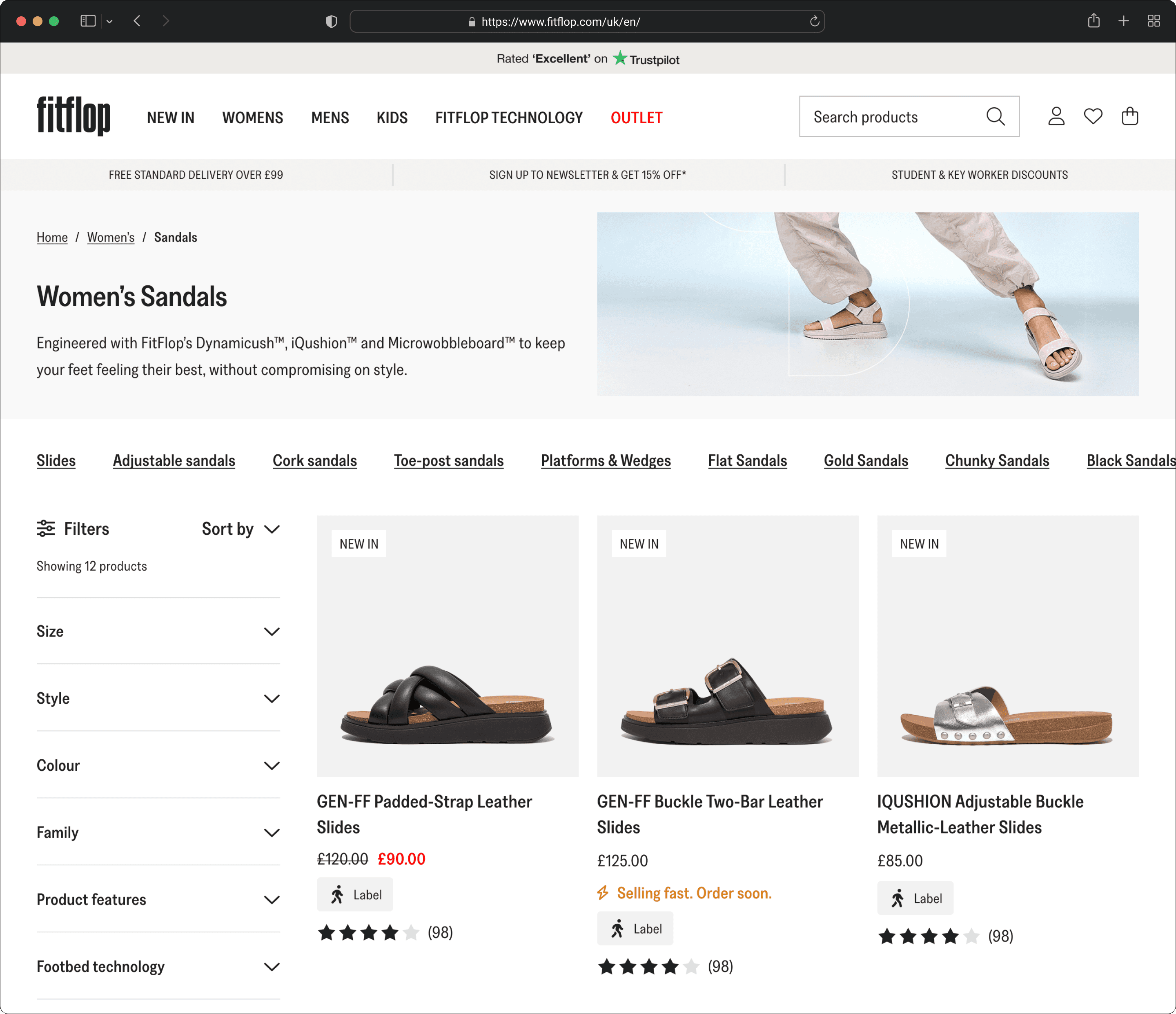
Product list page after I redesigned it

Product description page after I redesigned it
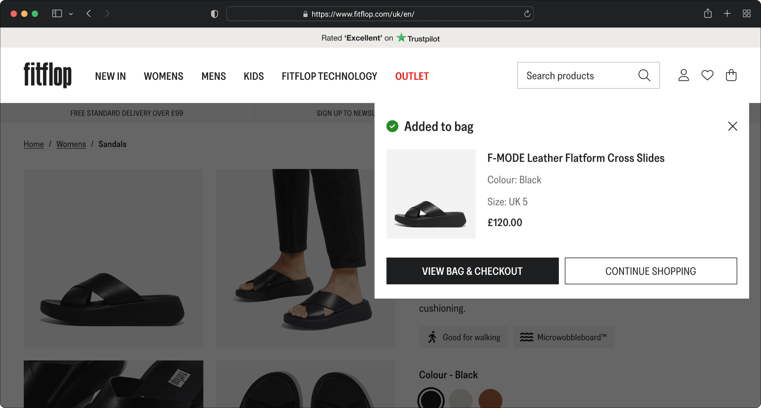
Bag flyout after I redesigned it

Bag page after I redesigned it
More projects

Get in touch
Want to chat about a project? Reach out at contact@aaronhowes.com